How to Increase The Conversion of a Selling Site Through The Technical Condition
Specialists from KUBAS Labs have come across many cases when an existing company website acts as a kind of ineffective Internet enterprise flyer. The resource, in the development, was invested a lot of money and time, leads 1-2% of clients per year, and its main task is to exist because competitors have the same sites simply. We are confident that our experience in eCommerce development services can help you avoid such troubles. Therefore, we have collected a few tips in this article.
So, the company’s website’s main task is to facilitate the implementation of everyday tasks for the user:
- information search;
- ordering purchases and services;
- communication.
To do this, you should provide it with all the necessary tools and make your stay on the site as comfortable as possible. Very often, it is technical flaws that are the reason for the client’s departure. Therefore, pay attention to the following technical details:
- Page speed. For every new second, a user spends waiting for a page to load, the conversion rate decreases by about 7%. Therefore, it is important not to burden the pages with unnecessary graphical elements and to optimize the code to reduce the number of requests between the browser and the server. The optimal time is up to 3 seconds.
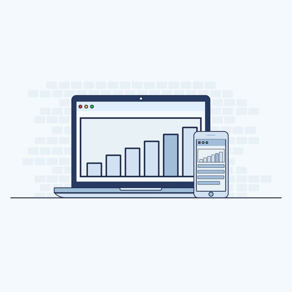
- Mobile Responsive is another essential aspect affecting mobile traffic conversions. In the previous article, we said that this is more than half of all visitors. The selling site must be perfectly displayed on all devices.
- The ability to search the site. If your corporate resource has many services, product cards, or has a blog, the search function is a must. This makes it much easier for the user to find the desired pages and significantly increases the likelihood of ordering.
- Filters and the ability to compare. Often, company websites function as an online store, and for it to work effectively, it is necessary to provide appropriate tools. The filter allows you to facilitate the process of searching for a product according to specific criteria, and the ability to compare several similar products significantly saves time for the buyer.
How to Make a Website Selling Using Design
Marketing design is a fundamental component of high conversion rates. The critical task of the designer is the convenience of the interface. Most visitors are entirely indifferent to what color your logo is or the choice of font in headlines. But the presentation structure and the layout of the buttons can play a decisive role. Besides, interactive tooltips and icons that indicate the performed actions increase conversions. When designing mobile screens, remember to place buttons where they are most comfortable reaching your right thumb.
To develop from scratch or update an existing website, we recommend contacting professionals. KUBAS Labs web development company provides full-cycle custom web development services. Leave a request for a consultation, and we will offer working technical and design strategies that will increase the conversion of your site.


